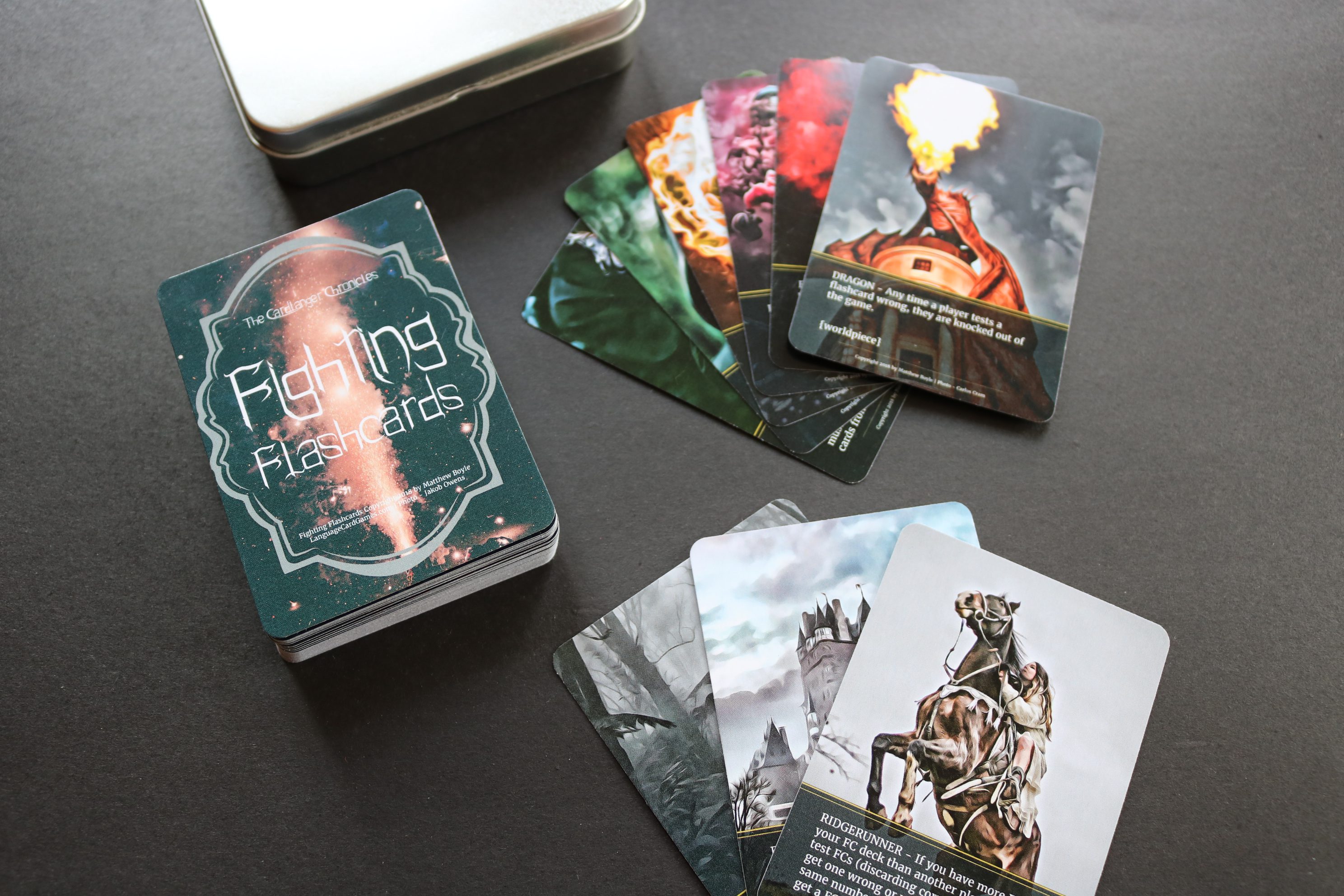
Hi there, everybody, and welcome back. My name is Matthew Boyle, and I’m from www.languagecardgames.com. This video series is about how to go from having no card game to selling your first card game; how to go from zero to one, and in this video, we’re going to talk about the actual design or layout of your card for your game.
I think maybe the most important thing to think about when you’re designing the card is, first of all, it has to be highly functional when people play the game. But before even that, the reason why the design is important is because that’s your advertisement. Let me say that again because it’s so important: the design of the card is the first advertisement. It’s the first thing that people see in the picture or the videos that you’re going to be sharing, so that is a very powerful form of advertising – an attractive, eye-popping, beautiful-looking card.
When you think about the design, think about how it can look attractive and look unique. For me, another thing that is worthwhile to think about is how can the card look clean and sleek? Now, this is just my personal preference, and you may like a very complex card or a very complex game, and if you’re good with that, then go for it. But what I want to recommend is you make the card look unintimidating, even though the card game may be very challenging and interesting and complex. I would put just the essential information on that card, and you want to use different sizes of fonts to make the unimportant things smaller and the most important things larger. You want to make it very clear and easy to see and understand: what’s this card all about? Some of the card games that I see, if the card is very cluttered with stuff, it’s unattractive, at least to me.
If you think about some of the most amazing designs and inventions, even in recent human history, even though the device or the invention can do some very amazing things, it is at the same time extraordinarily simplistic, and there’s a beauty in the simplicity. So think about how to cut the fat and put the most essential things into the design of your card. That should prove to be very attractive and advertise well to potential customers.
That’s it for the video on card game design and layout. As always, if you want to talk about it more, let’s do so in the comments section. But for now, let’s move on to the next video. Thank you so much for sticking with me. I hope you’re finding it valuable. If you are finding this video series valuable, don’t forget to like and subscribe. Okay, let’s move on to the next video.


